In Conversation with Gabriella Sanchez: Experimenting with Text and Imagery to Subvert and Provoke

Courtesy of the Charlie James Gallery.
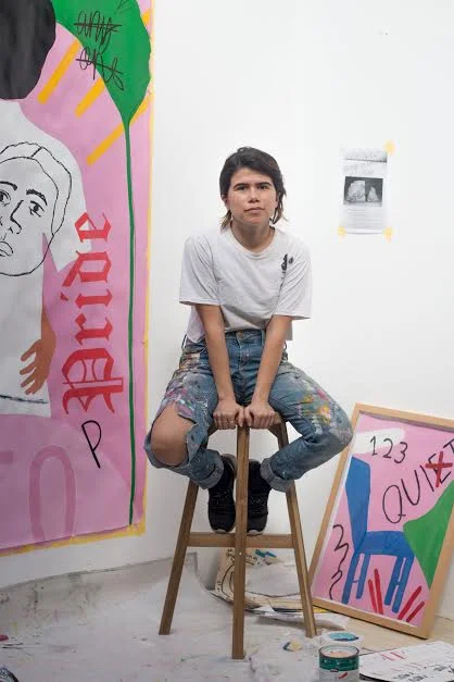
Gabriella Sanchez’s (she/her) mixed-media works are a riot of poppy colors deftly juxtaposed, letters that function both as graphic elements and cryptic messages, energy galore, and intrigue. The artist herself—born and based in LA—is just as compelling. Sanchez earned her BFA from the Christian liberal arts college Point Loma Nazarene University in San Diego, then jetted off to Paris to work as a nanny and freelance graphic designer. Since returning home in 2013, she’s been designing for clients like Nike and Planned Parenthood while building an attention-getting art practice, including landing representation by Charlie James Gallery.
Kristina Feliciano: I’m curious about your creative process. How do you develop ideas before translating them into paintings?
Gabriella Sanchez: The first step is writing. I have a long-running google doc with personal essays and notes I write before beginning a new series. Sometimes that writing prompts more reading, researching, and then results in more writing. That process repeats until I feel like I’ve worked through my concepts, have filled myself up to the brim, and can now let it spill over onto the canvas, paper, etc

Pudica, acrylic, oil pastel and pencil on canvas, 48 x 36 inches. 2018.
Your work references artists like Ed Ruscha and writers such as Oscar Wilde. What is it about them that inspires you to comment on?
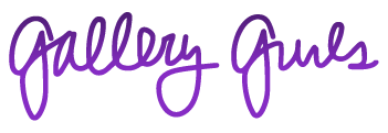
I use Oscar Wilde as a stand-in to represent the side of an aestheticism view point (art for art’s sake). I’m interested in studying psychographics in a visual art context and exploring whether it is even possible to create art for art’s sake as an artist of color. You’ll often see my work depict a Sans Serif font alongside a Gothic Script font. This is done to tease out the psychological connections between these visual signifiers — for example, taking the name ‘Oscar’ and depicting it in a Sans Serif font and then displaying it in a Gothic Script. It’s the same name but the image of the person you imagine it being tied to, changes with the font.
My interest in the work of Ed Ruscha is connected to this exploration. I took Sans Serif and Gothic Script text from two of Ruscha's paintings and wove them into my pieces Rebel Rebel and Homes. Same words and same font style, but placed in the context of my work, to see the new associations that arise, and how my perceived identity influences how a viewer now reads the meaning behind the visual styles.

Enter / Homes / Street, acrylic, sharpie, pencil, oil pastel and beaded ap- pliques on paper, 72 x 48 inches, unframed, 2017.
You also do design projects for clients ranging from Nike to Planned Parenthood. How does that work complement or influence your fine art?
My high interest in composition and intermingling of text and imagery is definitely born out of my background in graphic design.
What inspires you about the art scene in LA, and what do you wish was different?
Los Angeles is home, so what inspires me most about the Los Angeles art scene is that my family can be a part of it all. I don’t have any criticism of the Los Angeles art scene that I wouldn’t have of the art world-at-large — one, being more artists of color at the top, especially women.
What's next for you through the end of this year and into 2019?
I have a couple group shows coming up before the end of the year, and later in 2019 I’ll have another solo show at Charlie James. I also have a couple public art ideas I’ve been wanting to execute for awhile, so hopefully that will be able to happen in 2019.
“Los Angeles is home, so what inspires me most about the Los Angeles art scene is that my family can be a part of it all. I don’t have any criticism of the Los Angeles art scene that I wouldn’t have of the art world-at-large — one, being more artists of color at the top, especially women.”

Open, acrylic, sharpie, spray paint, beaded and embroidered appliques on paper, 72 x 48 inches,
unframed, 2017.

Anyone, Acrylic, sharpie, oil pastel and embroidered appliqués on paper, 72 x 48 inches, framed, 2018.
Follow Gabriella Sanchez @_gabriella_sanchez


